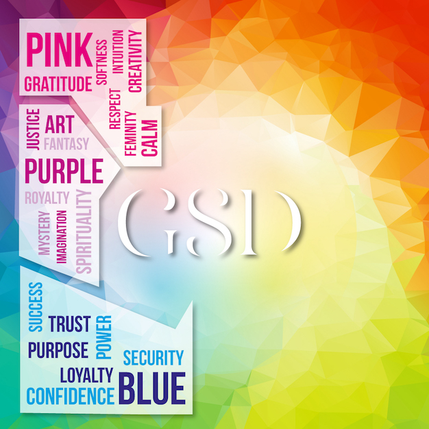
If you are getting ready to start a new business venture, or getting ready to give your brand a face lift. One of the most important things to consider, is how you want your brand colors to make your perfect client feel. The psychology behind your brand colors says a lot about who you want to attract.
Given that I went to school for psychology and worked in mental health, it's an understatement to say that I geek out about this stuff. So rather than making choices blindly, let's add some rhyme and reason to your decision.
The choices of colors in your company logo, website design, and marketing materials can have an impact on the effectiveness of your marketing campaigns. With my background in psychology, we structure everything around this.
Here is the psychology behind how colors affect people’s perception of your brand below:
Pink: When you think of pink? What do you think of? For me, I think of breast cancer awareness, Victoria's Secret, Air B&B, Lyft, Barbie, Pepto-Bismol, Vineyard Vines, and LG. Below are a few words that describe how these brands want you to feel when you are interacting with their brand.
- Gratitude
- Softness
- Respect
- Intuition
- Femininity
- Calm
- Creativity
To sum it up, it makes me think of waking up in the morning in an Air B&B watching my LG TV (not really because I never watch TV), drinking my Pepto-Bismol because I ate shit food last night. I hop out of bed, slip on my very sexy yet uncomfortable bra from Victoria's Secret (I'm kidding because I only live in sports bras), throw on my pink polo from Vineyard Vines and schedule a Lyft to drive me to a breast cancer awareness event. In tow with me is my niece who is scrolling on my iPad through Instagram looking at people's profiles looking like plastic Barbie dolls. Can you gather that I don't really interact with these brands?!!!
If you want to know more about the other colors and how they help and affect your brand, be sure to check it out on next week's blog!


